Home / Technology / Google Ditches Flat Icons for Softer, Gradient Look
Google Ditches Flat Icons for Softer, Gradient Look
27 Apr
Summary
- New icons feature softer, rounder corners and gentle gradient transitions.
- Updated designs move away from uniform circles to more varied layouts.
- The shift reflects a trend toward more playful and vibrant visual styles.
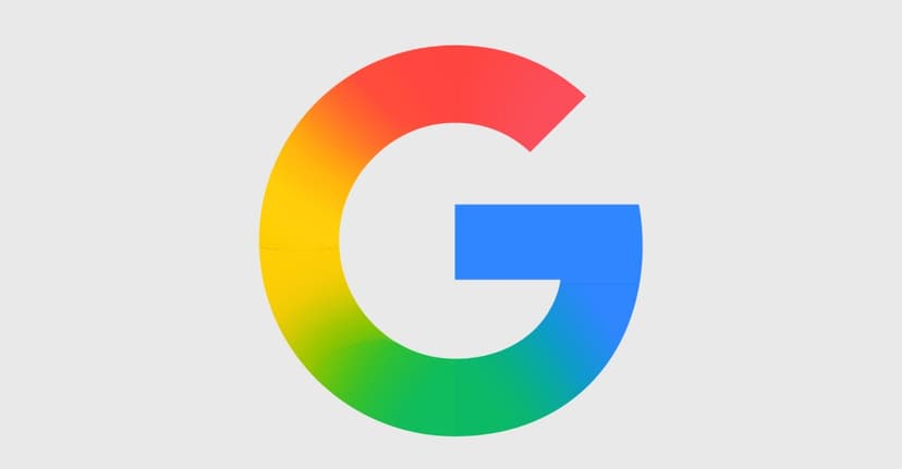
Google is transitioning its application icons to a fresh, gradient-heavy design, a rollout that began in late 2025. This evolution moves away from the previous uniform circle motif, introducing softer corners and gentler color transitions.
The new visual language has already appeared in updated Google G, Gemini, Photos, and Maps icons. Reports suggest this stylistic shift signifies the integration of AI-powered features within Google's services.
Apps like Sheets, Slides, Forms, Sites, and Keep are shedding their older, flatter appearances for more dynamic layouts. This update aims for a more playful and varied aesthetic, aligning with modern design trends that favor vibrancy over the stark flatness of recent years.
While most icons represent an improvement with increased visual distinction, the transition is ongoing. The exact timeline for the full rollout remains unconfirmed, but it is anticipated soon.


