Home / Business and Economy / Coke's New Font Sparks Marlboro Doppelgänger Debate
Coke's New Font Sparks Marlboro Doppelgänger Debate
24 Jul
Summary
- Coca-Cola unveiled a new brand identity with a custom serif font named Better With.
- Critics noted similarities between Coke's new font and Marlboro's Neo Contact typeface.
- Designers clarified differences, attributing similarities to common serif font usage.
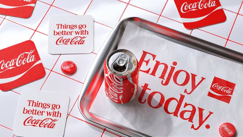
Coca-Cola recently introduced a new global brand identity, featuring a custom serif typeface called Better With. This update has drawn comparisons to the font used by Marlboro cigarettes, with online commentators noting a resemblance in color and style.
However, graphic designers and typographers clarify that the fonts, Better With for Coke and Neo Contact for Marlboro, are distinct. They explain that shared characteristics are a result of contemporary brands frequently utilizing serif fonts, often invoking a sense of nostalgia.
Brody Associates developed the Better With typeface, initially for Coca-Cola's 2023 holiday marketing. Its design includes exaggerated serifs and rounded terminals, contributing to its unique personality. While some see a similar 'vocabulary' to Marlboro's font, experts like James Edmondson highlight key differences in condensation and serif structure.
The discussion gained traction as the term 'fridge cigarette' became popular, referring to choosing a soda over a cigarette break. Coca-Cola and its design partners, JKR and Brody Associates, focused on the brand's legacy for the rebrand, drawing inspiration from a 1970s investor book.


