Home / Technology / YouTube's Redesign Promises a More Immersive Viewing Experience
YouTube's Redesign Promises a More Immersive Viewing Experience
15 Oct
Summary
- YouTube's interface gets visual updates for a "cleaner and more immersive" experience
- Redesign includes translucent, rounded icons and updated controls
- Threaded replies in comments to make the section more readable
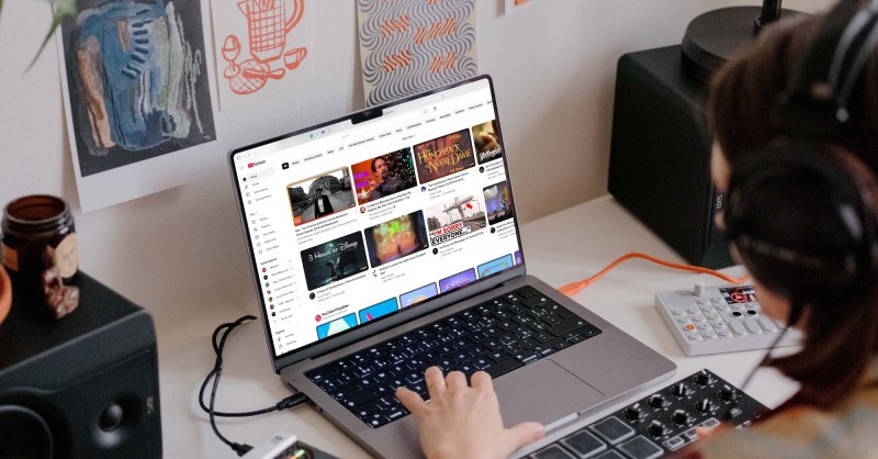
As of 2025-10-16T02:19:56+00:00, YouTube has introduced a redesign of its interface across all platforms, with the goal of providing users a "more expressive and intuitive experience." The update, which began rolling out just last week, features a cleaner and more immersive video player, including translucent, rounded icons and updated controls that obscure less content.
On the YouTube app for smart TVs, video details are now displayed in the top-left, with controls grouped below the progress bar. For mobile devices in landscape view, most controls are now consolidated in a pill-shaped button in the bottom-left corner. Additionally, YouTube has refined the double-tap to seek gesture, making it feel "more modern and less intrusive," and introduced seamless transitions when switching between tabs with "improved motion design."
Other notable changes include content-specific animations for the Like button, threaded replies in the comments section to make it more readable and less chaotic, and improved visuals when saving videos to the Watch Later list. YouTube says these subtle yet impactful updates aim to enhance the overall user experience by providing a cleaner, less obtrusive interface and more intuitive controls.


