Home / Technology / Instagram Fights Duo's Odd Screen for Better User Experience
Instagram Fights Duo's Odd Screen for Better User Experience
17 Nov
Summary
- Instagram's head acknowledges the difficulty of adapting the app for the Duo's unique screen.
- The app was designed for tall vertical screens, posing challenges for the Duo's wider format.
- Instagram is actively working to improve the app's usability on the Duo's various orientations.
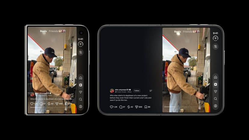
Adam Mosseri, the head of Instagram, has revealed that adapting the social media application for the iPhone Duo's distinctive screen presents significant design challenges. He noted that the app's original design was optimized for conventional tall, vertical smartphone screens, making its integration with the Duo's wider and shorter form factor complex.
While acknowledging that using the app in portrait mode on the larger, unfolded screen offers the most favorable experience, especially for viewing Reels, Mosseri confirmed that Instagram is actively working on improvements. The development team is addressing user feedback, particularly concerning interface elements like the 'double stack' of buttons that have drawn criticism since the app's global release on October 23.
Mosseri highlighted specific issues, such as the placement of navigation buttons coinciding with Reels' like and comment controls on the Duo's closed screen, which creates an awkward user experience. Instagram is reconsidering these design choices to ensure a more intuitive and pleasing interaction across all orientations of the device.


