Home / Arts and Entertainment / Wicked Movies' Visuals Under Fire: A Color Crisis?
Wicked Movies' Visuals Under Fire: A Color Crisis?
29 Nov, 2025
Summary
- Fans criticize the dull color grading in both 'Wicked' films.
- The visual presentation is compared unfavorably to older classics.
- Extended runtime is seen as a significant flaw beyond aesthetics.

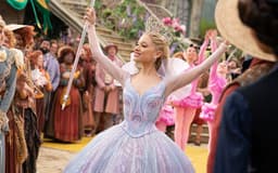
The recent "Wicked" films are drawing criticism for their muted and muddy visual aesthetics, a stark departure from the vibrant Technicolor of cinematic predecessors like "The Wizard of Oz." Fans and critics alike have pointed to dull Emerald City greens and desaturated iconic imagery, questioning the color grading choices made by director Jon M. Chu and cinematographer Alice Brooks. This visual dissatisfaction has become a talking point on social media, with some humorously attributing the issues to directorial oversight.
Beyond the visual shortcomings, the "Wicked" movies are also being scrutinized for their excessive runtime. The adaptation of a stage musical, which itself is relatively brief, has been significantly expanded, leading to narrative bloat. Critics argue that the extended length, featuring unnecessary new songs, weakens the overall film and could have been condensed for a more impactful experience. This, coupled with the uninspired color palette, suggests a broader issue with modern blockbuster filmmaking.
Despite these aesthetic and structural criticisms, the performances of Cynthia Erivo and Ariana Grande-Butera have been widely praised, and certain emotional moments have resonated with audiences. However, the prevailing sentiment is that the films' visual presentation and pacing ultimately detract from their potential. The contrast between the colorful marketing and the lifeless on-screen result leaves many viewers disappointed with what could have been a visual spectacle.