Home / Arts and Entertainment / HBO Logo's Hidden Flaw: Can You Spot It?
HBO Logo's Hidden Flaw: Can You Spot It?
1 Feb
Summary
- A logo designer identified two perceived flaws in the HBO logo.
- He believes one 'mistake' in the B's alignment is real, but the O's is intentional.
- The original 1970s HBO logo designer confirmed the newer version contains an error.

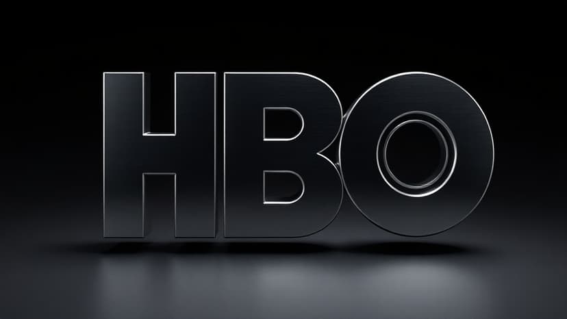
The familiar HBO logo, a constant presence since 1972, has recently drawn attention for two perceived 'mistakes' in its modern iteration. Logo designer James Barnard highlighted that the letter 'B' appears to sit lower than the 'H,' a detail he considers a significant error. He meticulously measured the logo using design software, confirming the misalignment.
Barnard, however, attributes the perceived higher placement of the 'O' to intentional design. He explained that a slight 'overshoot' is often necessary for circular elements to appear visually balanced against straighter shapes, correcting optical illusions. This technique ensures the 'O' doesn't seem smaller than the 'H.'
Further analysis by Barnard revealed a sharp transition in the 'B' character's curve, creating a kink due to the 'Bone Effect,' another optical illusion. Gerard Huerta, the designer behind the original 1970s HBO logo, corroborated Barnard's findings, sharing his mistake-free original traced drawing. Huerta emphasized the meticulous hand-drawn process involved in creating logos before widespread digital tools.
While such minor errors might have gone unnoticed on older screens, they are now more apparent on larger, higher-resolution displays. Barnard noted that these inconsistencies can stem from successive edits, reliance on old templates, or rendering issues when transferring designs into vector formats for various media.


