Home / Arts and Entertainment / Emma's Design Secrets: Beyond Beauty
Emma's Design Secrets: Beyond Beauty
30 Jul
Summary
- Production design used color to enhance character personalities.
- Pastel shades inspired by Georgian interiors set the film apart.
- Curated spaces amplified comedic misunderstandings and romance.
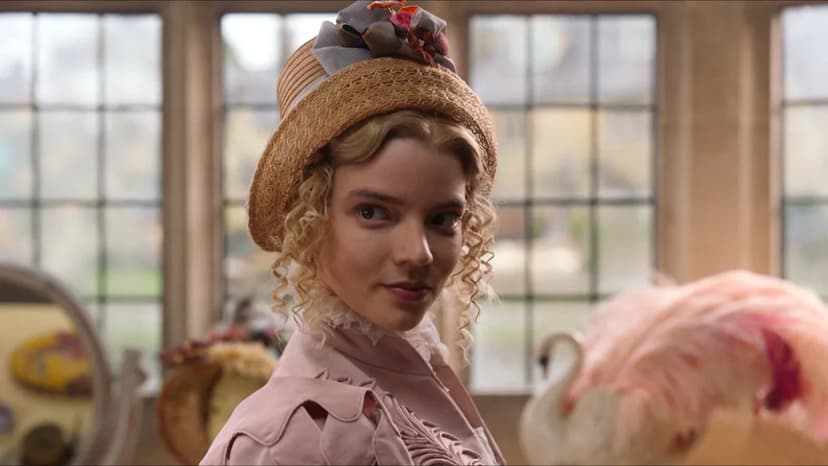
The production design in the adaptation of Jane Austen's "Emma" transcends mere aesthetics to deeply reinforce character personalities and the film's overall tone. Led by production designer Kave Quinn, the adaptation embraced an elegant palette of soft, Georgian-inspired colors, departing from the darker hues often found in period pieces.
Quinn meticulously coordinated color choices with the costume department. This ensured a harmonious visual composition across clothing, furniture, wallpaper, and architectural elements. The design choices established a playful atmosphere that complemented the film's lighthearted humor while retaining the sophistication inherent in Austen's work.
Finding the ideal location for Emma Woodhouse's estate, Hartfield, presented a significant challenge. The filmmakers sought a historic property that offered creative flexibility for interior alterations without compromising its integrity. The resulting production design created a distinctive visual identity for the adaptation.
These carefully curated spaces amplify the film's comedic misunderstandings and romantic encounters. Every room serves as an extension of the characters, contributing to a unique visual narrative. This approach blends historically inspired design with bold, tasteful color choices, resulting in a world that feels both authentic and refreshingly original.


